Authored by Pronoy Roy - AI Engineer — AI/ML & Data Science, WaveMaker, Inc.
In any application development project, designers and developers often find themselves in a constant back-and-forth, striving to meet launch deadlines. While tools like Figma and Storybook have improved the hand-off between these teams, they are primarily geared towards speeding up development. Though these tools also benefit designers by providing measurable guidelines, the real challenge lies in maintaining those guidelines effectively.
The only way to standardize designer-developer handoffs and to make sure people agree on the processes is by having a design system that has been designed by designers and then implemented as a design system in their development framework by developers.
This is where design systems come into play, filling the gap that often exists between design and development. By adopting the development approach of reusability, design systems offer a structured way for designers to define the limits and scope of a project. Utilizing design tokens and variables, they significantly reduce decision fatigue for both designers and developers, leading to more efficient and cohesive workflows.
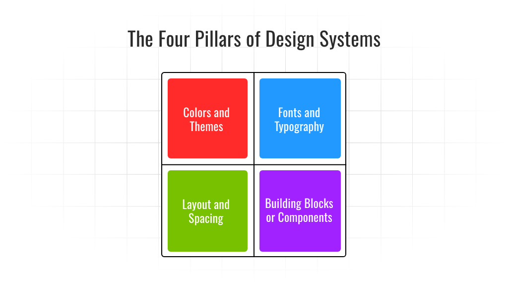
For developers, understanding design systems isn't just about knowing the tools - it's about comprehending the concept and applying it to enhance their development processes. The foundation of any design system rests on four central pillars:

Understanding and implementing these pillars in your development workflow leads to a more efficient and standardized process. Developers no longer need to worry about creating everything from scratch—instead, they focus on how to best utilize the existing components and styles to achieve the desired outcome.
This guide is not just for designers or developers; it’s for any team looking to improve collaboration and streamline their design and development processes. Whether you’re starting from scratch or looking to refine your current approach, the concepts discussed here can serve as a valuable framework for building your design system.
To dive deeper into each pillar and see practical examples of how they can be applied, read the full blog here.
Read more insights on app development, technology, and WaveMaker on our blog.