Create Prefab using Third Party UI Widgets
In this section, you will learn how to use third-party UI widgets in Studio. We do this with the help of Prefabs. We will use the example of integrating Lightbox image viewer in our application. It involves two steps – creating prefab and using the same.
Pre-Requisites
- Download the resources needed from Lightbox image viewer and unzip the file.
Creating Prefab
- Click on Create from the Prefab tab of the [Project Dashboard](http://[supsystic-show-popup id=102])
- Enter a name and description for the Prefab
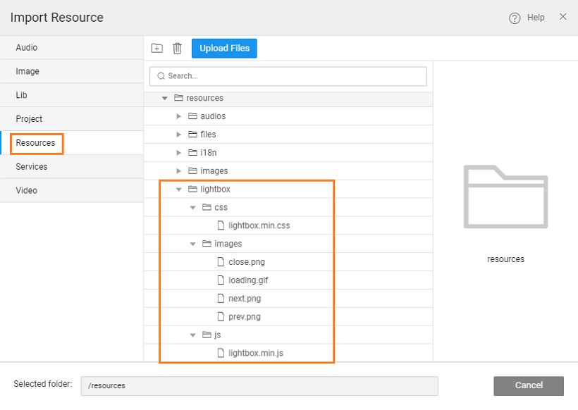
- Import the resources needed
- Create folder lightbox with three sub-folders css, js and images
- Upload the following files to their respective folders - lightbox.min.js, lightbox.min.css and four images. You will find these files in the respective folders from the extracted folder lighbox2-master/dist folder.
- From Project Configurations, choose Config Prefab under Settings:
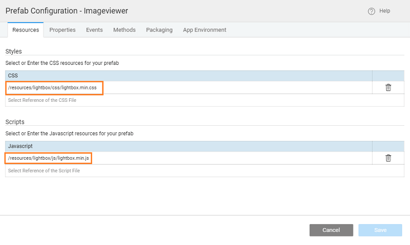
- Resources - delete the Main.css from Styles and add the following:
- Styles: include the css file imported in the above step
- Scripts: include the js file imported in the above step
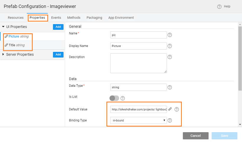
- Properties: any properties you want to expose to the user of this prefab. Here we have set two properties pic and title, both being in-bound.
- Resources - delete the Main.css from Styles and add the following:


| Name | Display Name | Data Type | Default Value | Binding Type | Widget Type |
|---|---|---|---|---|---|
| pic | Picture | string | http://lokeshdhakar.com/projects/ lightbox2/images/image-1.jpg | in-bound | text |
| title | Title | string | Image | in-bound | text |
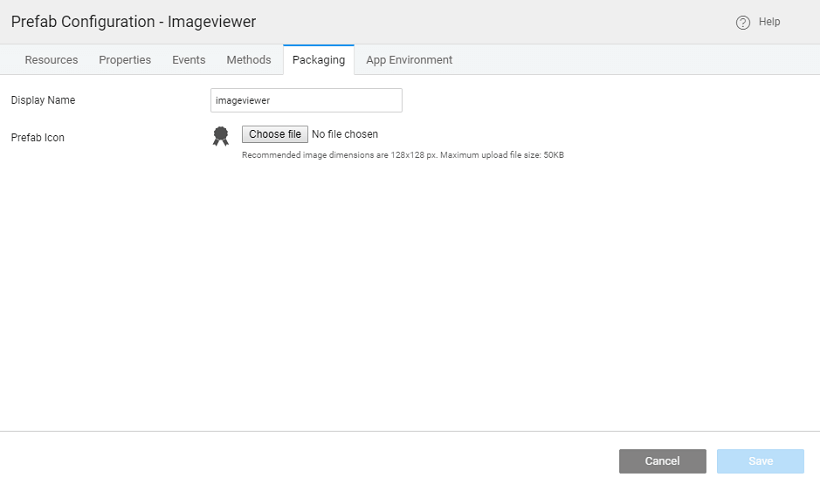
- You can set the group and icon to be associated with the Prefab from the Packaging section. This will be displayed in the Widget toolbox of the apps after Publishing the Prefab (next section).
Next we need to design the Prefab UI.
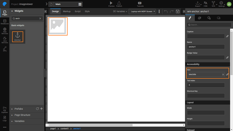
- Drag and drop an Anchor widget onto the canvas.
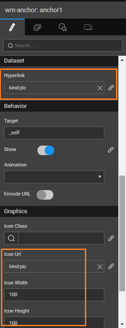
- Set Caption property to blank and bind the Prefab Properties defined in the previous step as follows:
Hint to the Prefab Property title,

Hyperlink to the Prefab Property pic and
Icon Url to the Prefab Property pic. Set Icon Width and Height to 100
As per Lightbox requirement, in the Markup add attribute data-lightbox _to the _anchor widget tag as shown below.

Be aware that the names might change as per your app specifics.
<wm-prefab-container name="page1">
    <a href="{{pic}}" data-lightbox="image-1" data-title="{{title}}"></a>
    <wm-anchor data-lightbox="image-1" margin="unset 0.5em" name="anchor1" caption="" hint="bind:title" hyperlink="bind:pic" iconurl="bind:pic" iconwidth="100" iconheight="100"></wm-anchor>
</wm-prefab-container>
- You can test the Prefab using the Preview option from the Main Menu, this will take the values provided in the Default Values section of Properties. You can change the In-bound property and see the change.
Using Prefab
We will use the Prefab to display the image in an app.
- Save and Publish the Prefab.
- You can set the version for the Prefab and Publish it. Know more about publishing Prefabs from here.
- Once approved, the Prefab will be available for use across the Projects. An entry will appear in the Artefacts list from the Developer Utilities on the Project Workspace. The Prefab needs to be imported before it can be used from the Widget Toolbox.
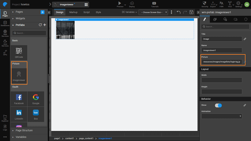
- Open/Create a project to see the usage of the above Prefab. Import the Prefanb from Artifacts listing dialog. Drag and drop the Imageviewer onto the canvas.
- Set the Title and Picture property. Here we are binding the Picture property to an image resource already imported into the app.
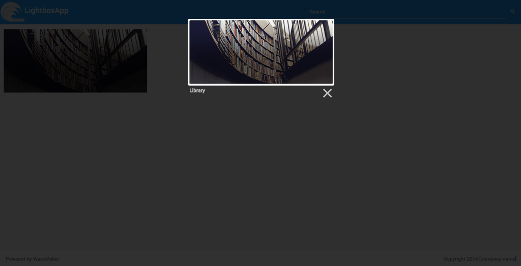
- Run the project, the image will be displayed.
- Hover the mouse over the image and see the name displayed in the hint field.
- Click on one image to set Lightbox in motion, the image is displayed in the center of the page.
See Also
Prefab to compare two strings
Prefab Using D3 & NVD3 Charts
Prefab Using D3 Library (DataMaps)
Prefab Using JQuery Plugin - showcases using Events and Methods