Data Table Configuration
Access to the following features from the Advanced Settings property of a Data Table.
Search & Filter Configuration
Search and Filter facility is particularly helpful when dealing with huge tables. Instead of restricting the data being displayed, the option can be left to the user to decide which data to be displayed.
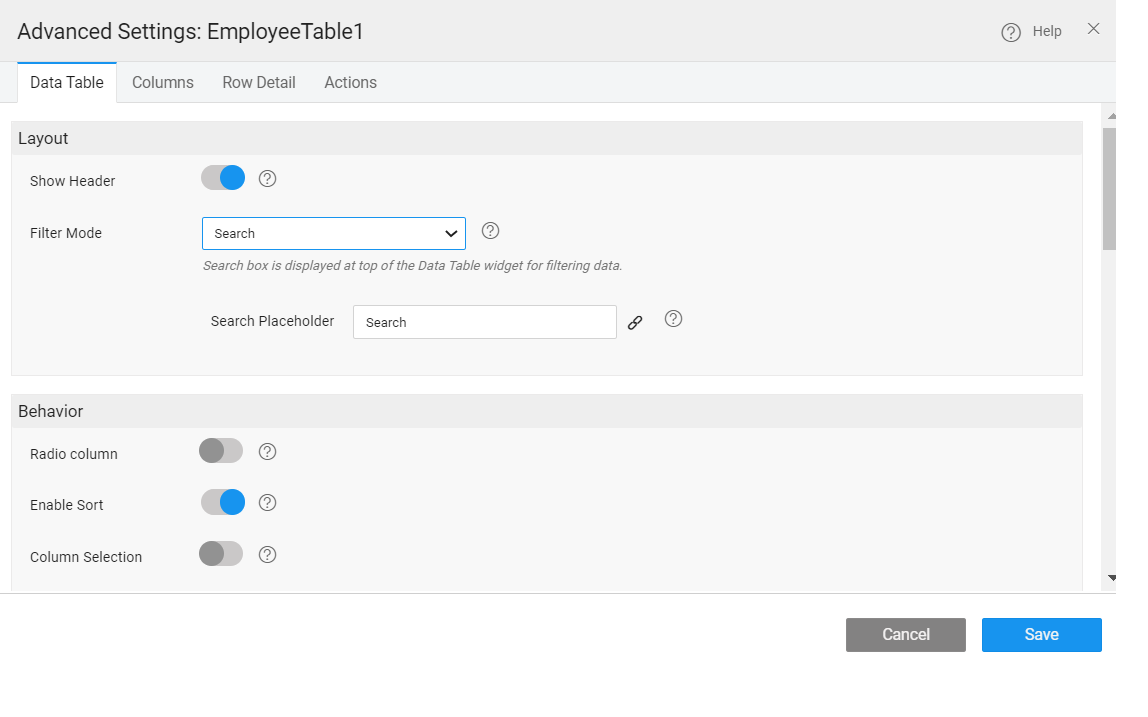
In WaveMaker this can be achieved via the filter mode property. The various options available are:
- no filter - would give a plain table,
- search - to include a search by field widget at the top of the data table, wherein the user can select the field on which the search can be performed,
- multi-column - to include filter conditions for each column based on the column data type. The condition could start with, ends with, is null etc. etc.. This feature can be disabled for a specific column from the column settings.
Sorting
You can add Sorting capability to a Data Table, thus allowing the end-user to sort the rows, based upon the column/fields of their choice. By enabling this property, every column header becomes clickable which toggles the display order. This can be overridden at the column level.
In case the underlying Variable has the order by field set, that will be honored with priority given to Data Table sort in case of conflict.
Selection
End-user can also be provided with a way to select rows and columns of a table.
- Select the first row by default
- Row selection can be either
- single with the display of a radio button or
- multiple with the display of a checkbox. This option is not available for Data Grid with Form layout
- Column selection needs to be further configured using the On Column Select and On Column Deselect events.
- For Quick Edit and Inline Edit, New row position can be specified to be at the bottom or at the top of the Data Table.
Pagination
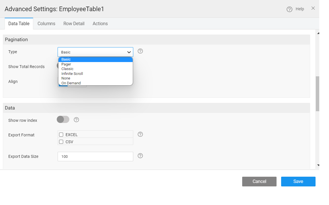
Pagination is dividing the set of data rows into discrete pages that will allow users to view data in the form of rows across pages. This should allow for easy navigation across pages for viewing and editing of data. This property depends on the underlying variable configuration. The records to be fetched per request decides the page size of the data table. If the records exceed that limit, then they will be displayed on the next page.
Pagination Type: To make complete use of pagination, the Data Table provides three unique types of pagination.
- Basic – This option gives a next and previous arrow along with the page numbers at the right bottom of the page.
- Classic - A bar with the total number of pages and number of items on the current page will be displayed along with arrows for pagination.
- Pager – This option gives the next and previous buttons at the bottom of the page which when clicked goes forward or backward one row.
Export Data
The user can Export the Data Table to an Excel or CSV format. This option is available only when the Data Source is a Variable based on database CRUD APIs or a Variable based upon a java service or depending on a query. 'Export Data Size' property on data table specifies the number of records to be exported. Based on the profile settings limit, records are fetched. If you specify an export data size value, records are fetched based on this value. By default, the value is set to 100, the maximum export size. To export more than 100 records, the max size in the profile needs to be changed from the Project Configurations menu of Project Workspace.
Only the contents displayed in the Data Table will be exported, as opposed to the contents of the entire underlying database table. For each column selected for display, you can customize the export value using Value Expressions. Value Expression has to be set for custom fields.
Message
Various messages to be displayed at various stages of Data Table rendering can be configured. For example, a message to be displayed when No Data is found or while Data loading etc.. Depending upon they layout type selected the message list will vary.
Message On Error, Message On Add and Message On Update can be configured for CRUD operations in editable grids.

